Erkaklar kiyim dökoni uçun yangi vizual uslub taklifiA new visual style proposal for a menswear store
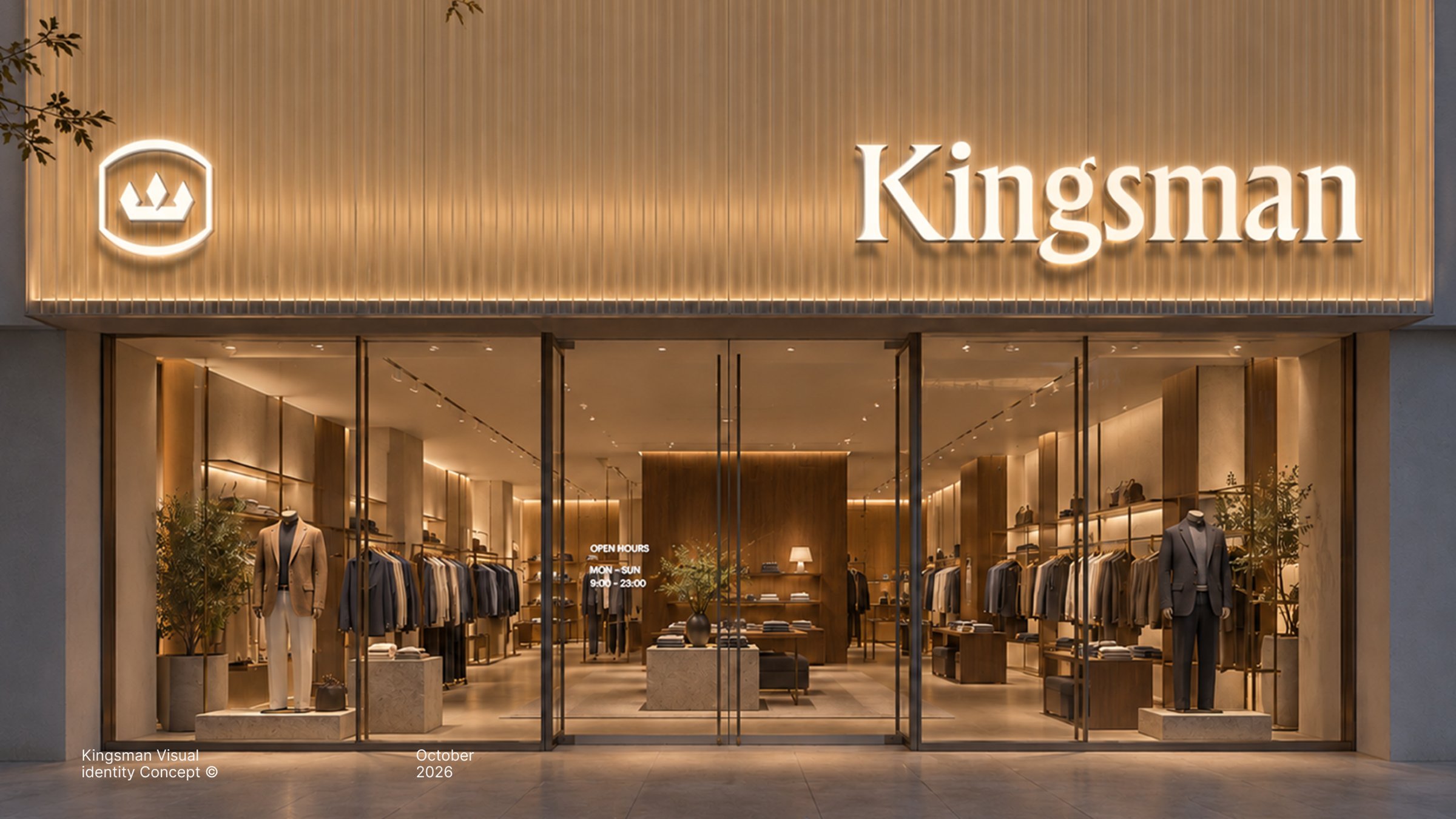
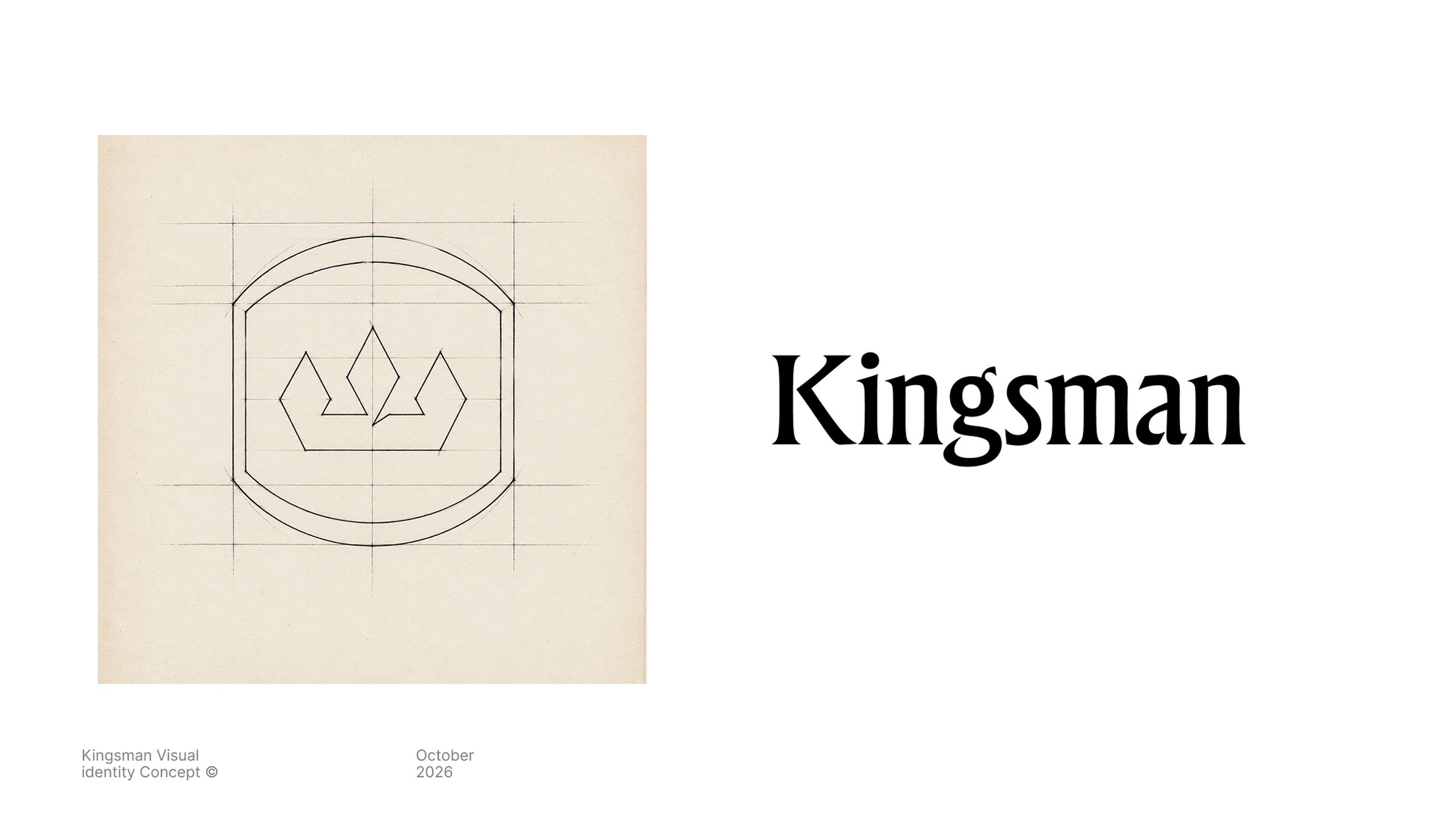
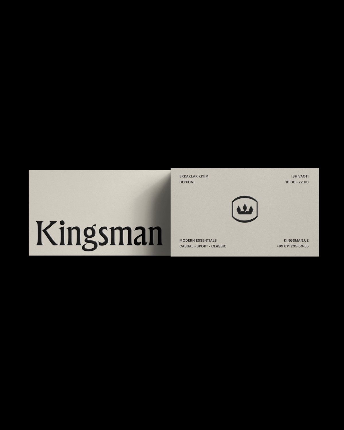
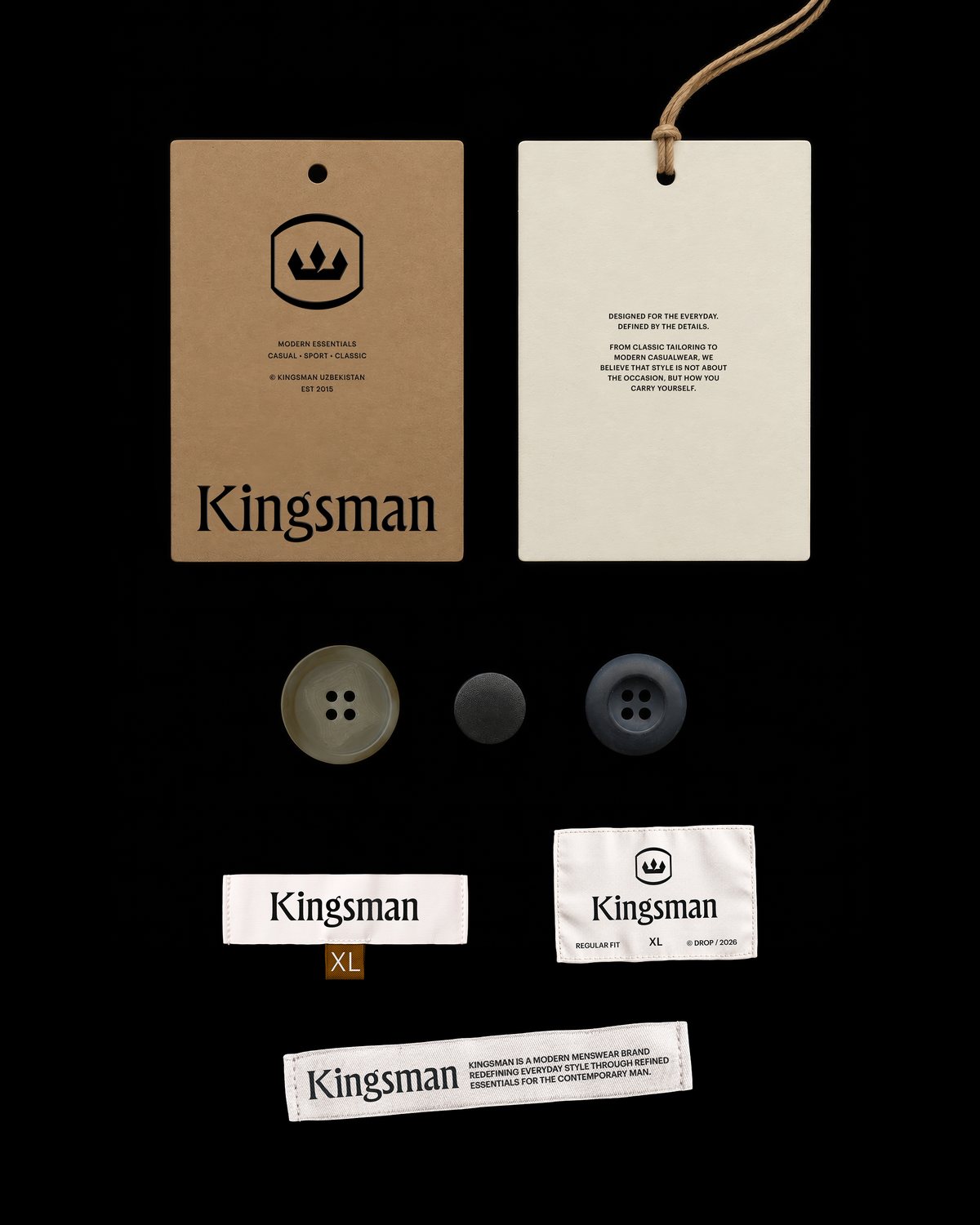
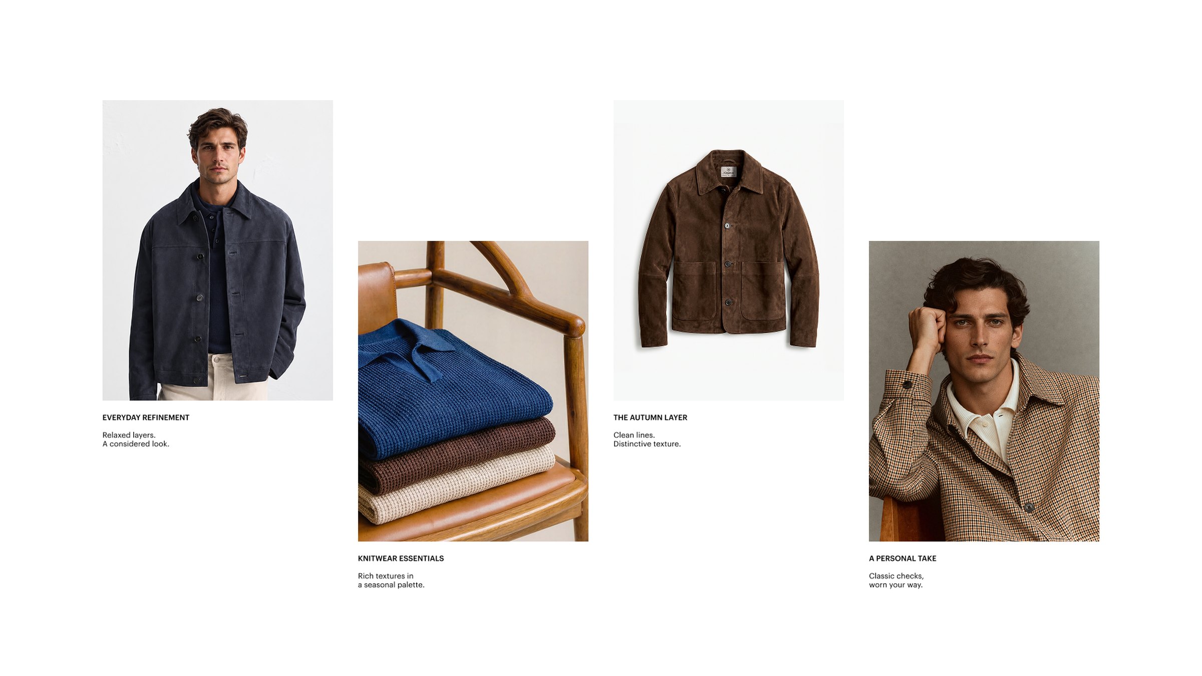
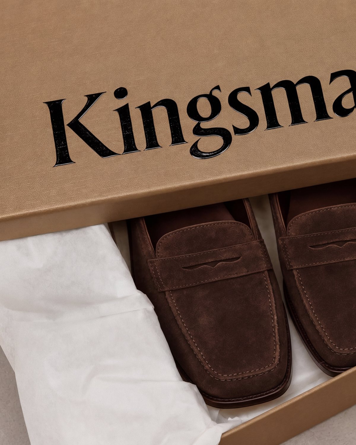
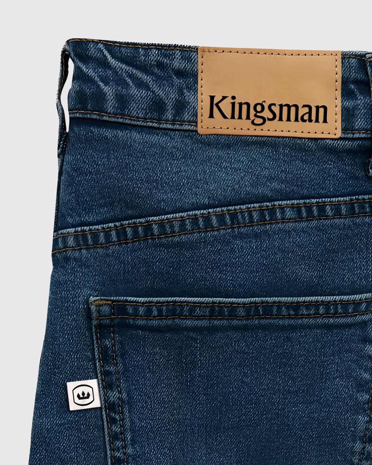
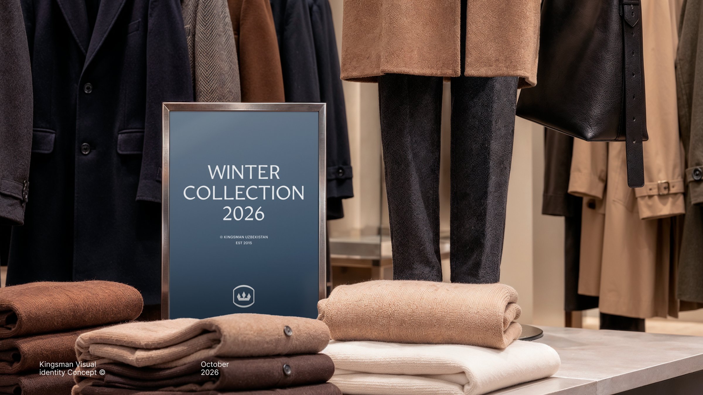
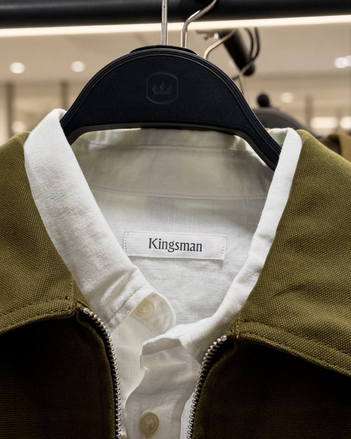
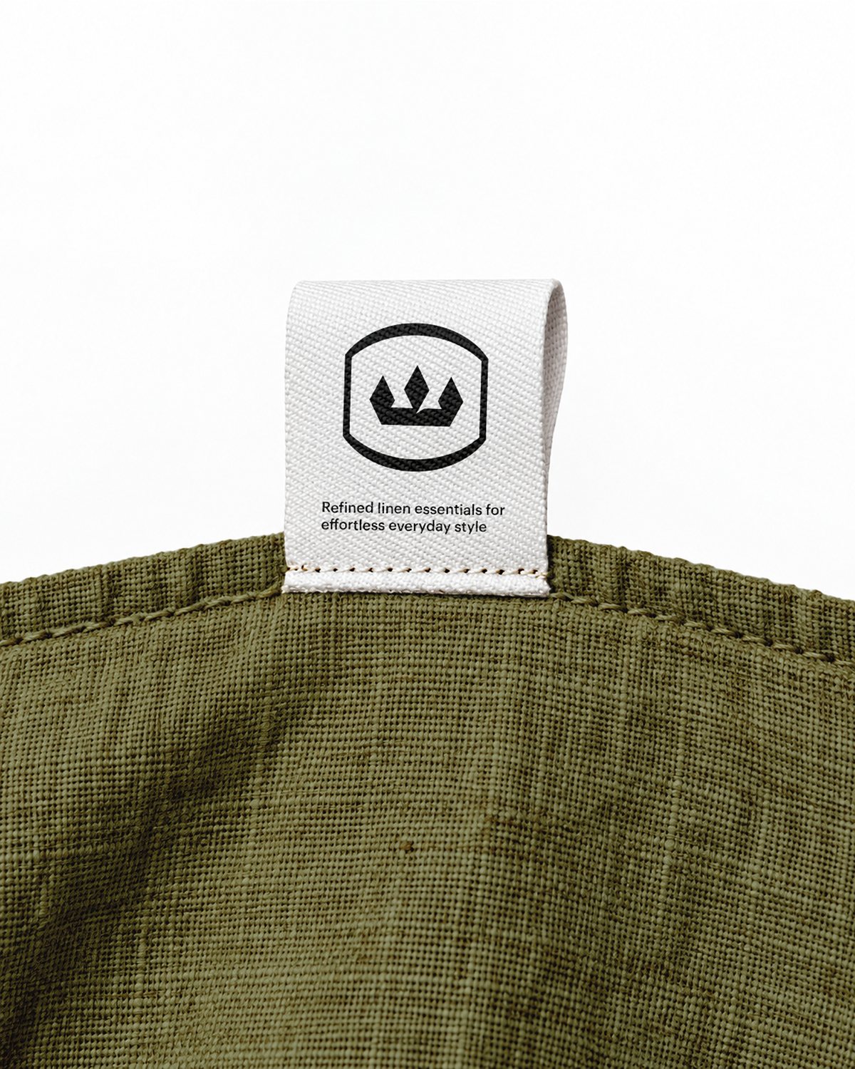
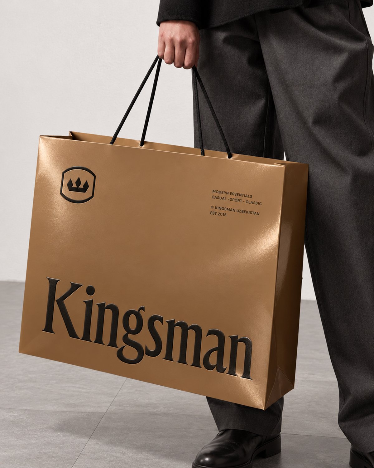
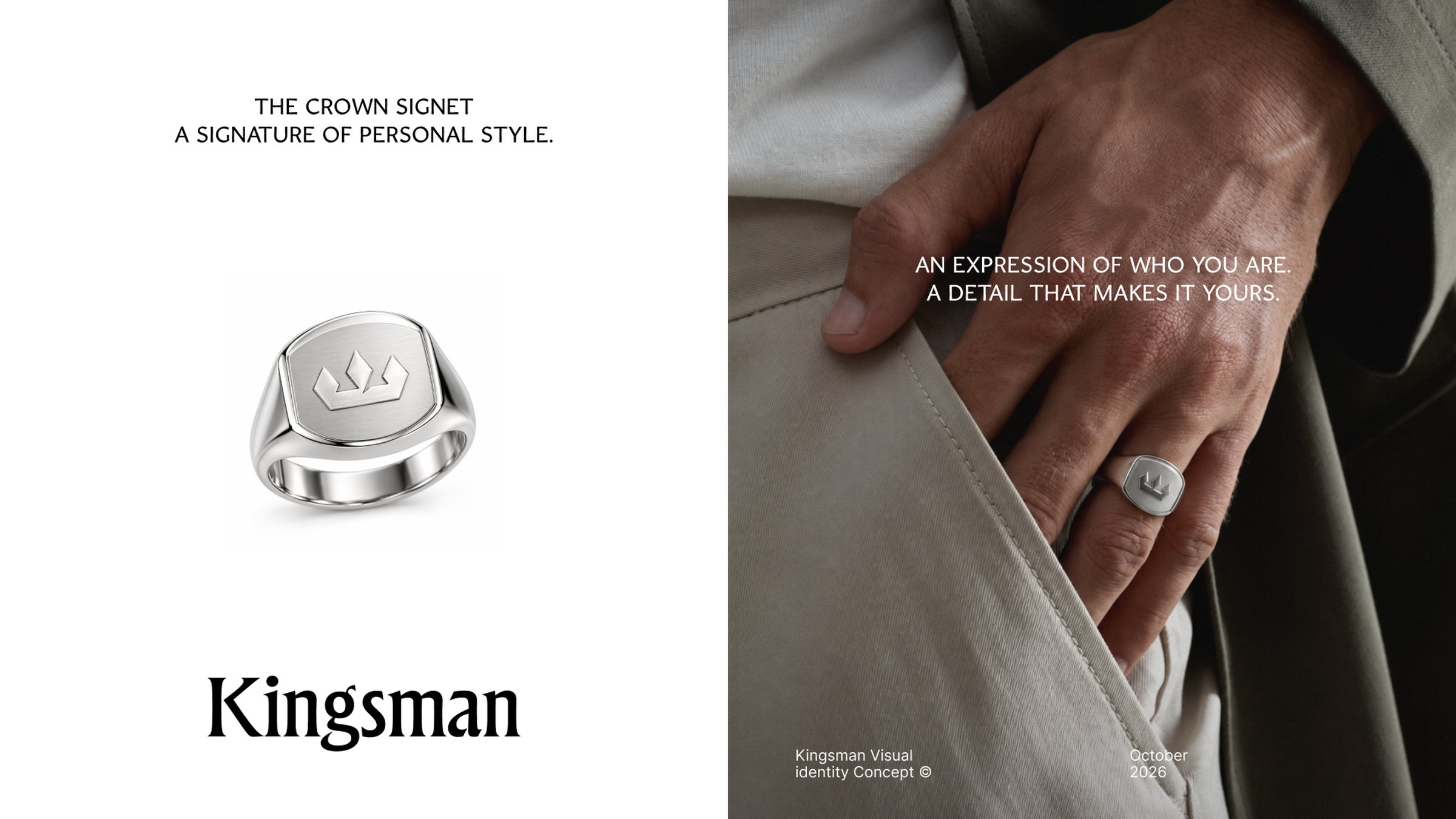
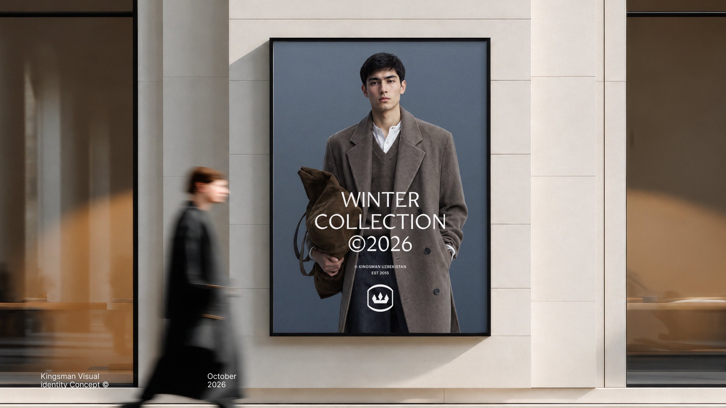
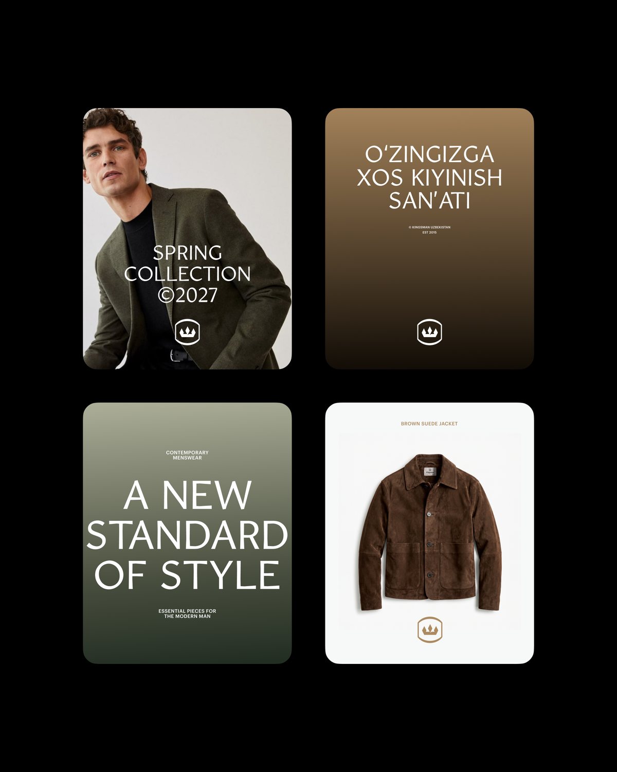
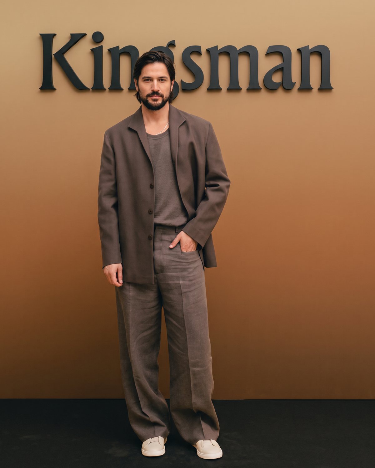
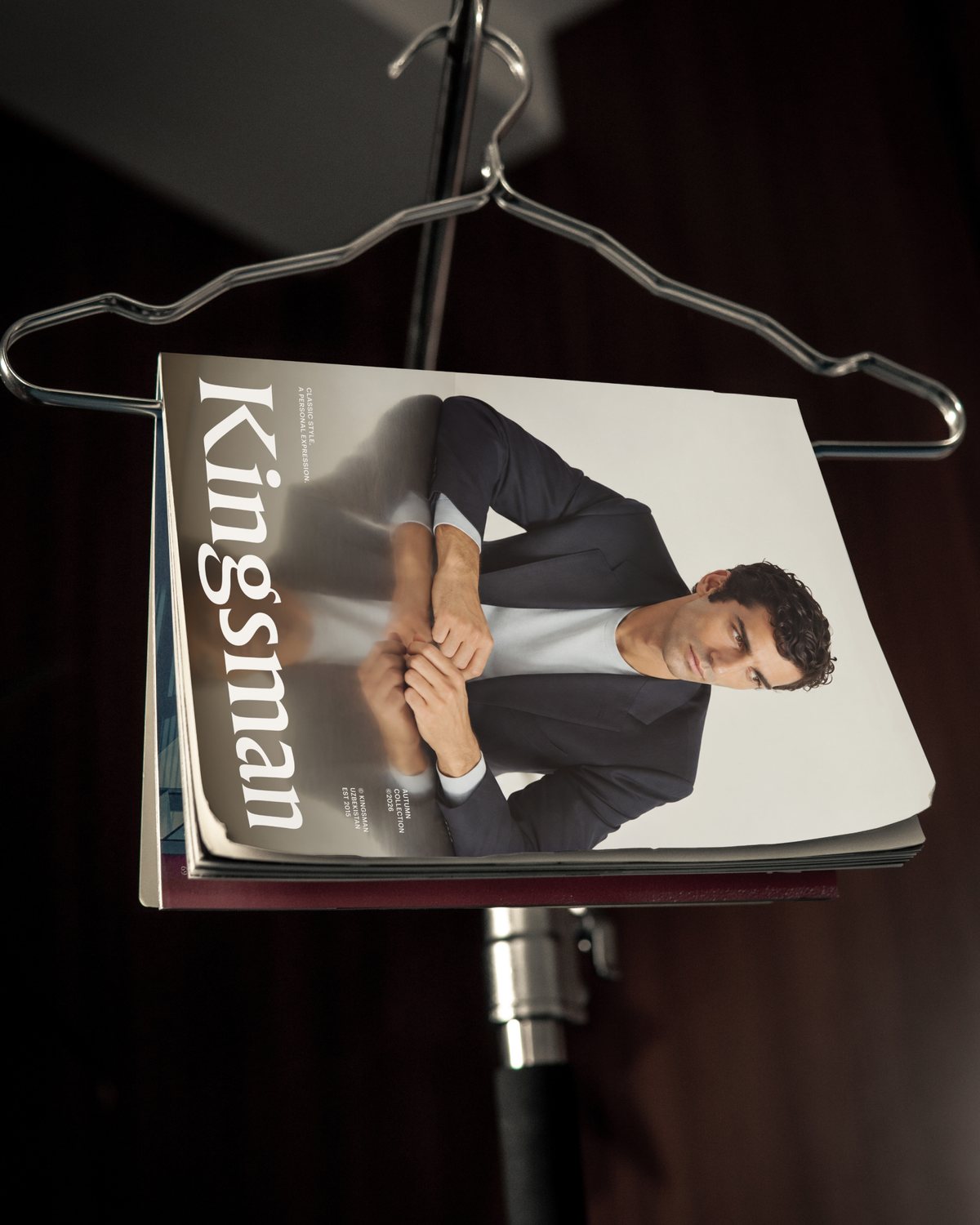
Kingsman yangi filiallar oçib, köproq xaridorlar bilan uçraşmoqda. Endi har bir dökon, qadoq va reklama materiali brend haqida bir xil taassurot berişi kerak. Rebrending konsepti barça filial va materiallarni birlaştiradigan yaxlit vizual uslubni taklif qiladi. Logodagi toj nomdagi “King” — qirol sözidan olingan: uning aniq geometriyasi salobat va zamonaviylik beradi, klassik şrift esa bu qat’iylikni yumşatib, logotipga xarakter qöşadi. Belgi va yozuv birga ham, alohida ham işlaydi — dökon peştoqidan kiyim yorliğigaça. Tört faslga mos ranglar va ikki şriftli tipografika brendni mavsumdan mavsumga yangilab turadi.Kingsman is opening new branches and meeting more customers. Every store, package and ad now needs to leave the same impression of the brand. This rebranding concept proposes a cohesive visual style that unites all branches and materials. The crown in the logo comes from “King” in the name: its precise geometry adds dignity and modernity, while the classic typeface softens that rigor and gives the logotype character. The mark and the wordmark work together or apart — from the storefront sign to the clothing label. A color for each of the four seasons and a two-typeface system keep the brand fresh from season to season.